Introducing a redesigned Patreon
May 19, 2022
Next week, you’ll see a significant upgrade to your Patreon experience.
Over the last few months, we've been working to make Patreon easier, faster, and more enjoyable for you and your patrons.
Today, we’re excited to share a preview of these upgrades, designed to make your most common workflows quicker and more intuitive. Now, the tools you use every day have been consolidated into a single, unified view, giving you complete access to everything you need to power and grow your membership.
You’ll also see an enhanced browsing experience across web and mobile. Your pages will load faster, the app will run smoother, and everything will just feel a whole lot sharper.
With this update, your patrons will have a clearer path to the things that they care most about — you and your creations.
Starting next week, here’s what you’ll see:
Your page, front and center
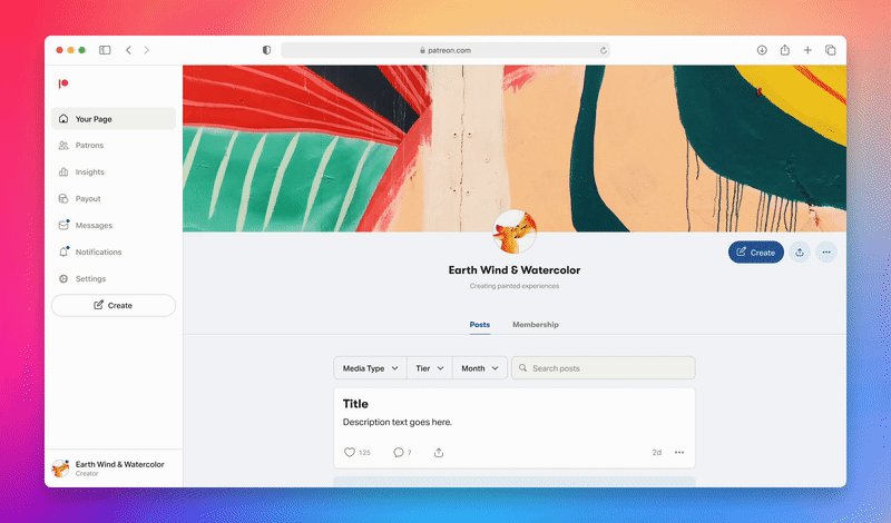
Now, when you log into Patreon as a creator, you’re dropped right into your workflow so you can instantly start creating. You’ll be able to see and edit all of your previous posts, or view your page from the perspective of your patrons or the public.
In that same right menu, you’ll be able to jump to editing your page and managing your posts.
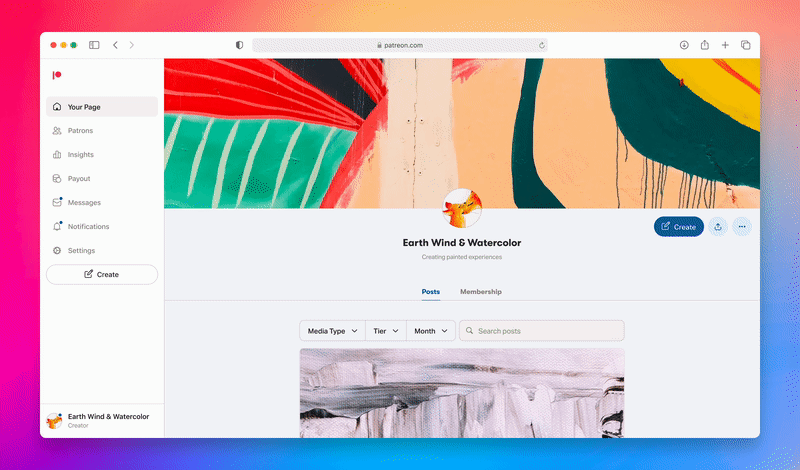
A more streamlined sidebar
The new top-level navigation gives you direct access to all of the tools you need to power your membership. The places you visit most frequently — Patrons, Insights, Payout, Messages, Notifications, and Settings — live neatly in your left sidebar. Your most common workflows, from creating posts to making withdrawals, are now right at your fingertips.
When you click into these sections, you’ll find relevant tabs across the top of your screen.
Seamlessly switch between profiles
Nearly one third of creators are also members of other Patreon communities, and we’ve heard from many creators that you want an easy, streamlined way to move between your creator profile and patron profile.
The new profile switcher will give you a lightning-fast way to step into your patron profile and back into creator mode.
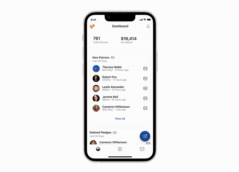
All of your insights in one place
Previously, insights were spread across many different pages, which made it difficult to get a clear and accurate picture of the health of your membership.
Now, you'll see the vital information about your membership, earnings, and posts in a single, unified view. No more clicking around to find the information you need. It’s all right there.
We are committed to giving every creator the insights they need to make informed, actionable decisions about their membership, including what tactics are working across income, membership growth, page traffic, and post engagement. In the coming months, you’ll see additional enhancements to the Insights experience as we build towards that vision.

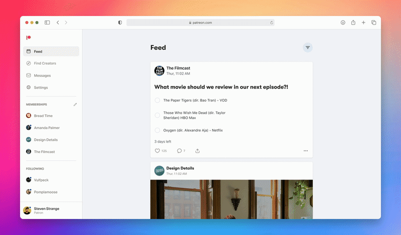
Easier than ever for patrons
With this update, your patrons will have a much clearer path to your creator page from their home feed and sidebar. The things they care most about — you and your content — are now front and center.
In case you missed it, we've recently made a number of improvements to the overall app experience. Search is cleaner, playback is smoother, and the audio tab has gotten a complete rework.
What’s next
The new experience will start rolling out to creators and patrons at the end of May across web, iOS, and Android apps.
If you have more detailed questions, you can also visit our support page for a full breakdown of what’s changing in our Help Center.